The Country Cottage
- Dec 23, 2020
- 4 min read
Updated: Jun 28, 2022
I used to drive by this house every day on the way to work, dreaming of what it could become, hoping for the opportunity to make it mine. It was well worth the wait. I envisioned the front porch with rocking chairs offering a great view of the hills across the country road. I imagined the creamy paint options that could enhance the original wood siding underneath the vinyl. I wondered what the interior looked like and hoped that I would get to see it someday. Each day my inspiration grew and I knew this house was the next project for me.

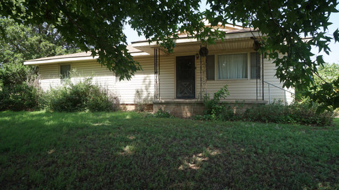

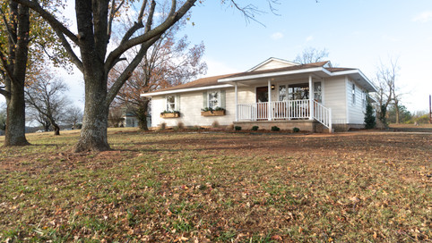
Cosmetically, this home was in desperate need of a complete rehaul. The original layout included a living, kitchen, dining, and laundry but each room was secluded and blocked off with multiple doors. I wanted to open it up as much as possible but still keep the defining spaces.


When I designed the kitchen, I wanted to combine modern functionality with timeless beauty. What I love most about the space are the small cottage inspired details, like the old antique pine console that I found on a road trip to Texas. I decided to use it as a center island and I love that it has scuffs and marks etched into it, adding so much character that will continue to patina over time. The open shelving was also inspired by the old homes when women spent most of the day in the kitchen. They needed the functionality of having everything out in the open and within reach, but we can beautify those items with thoughtful décor like wooden utensils and stone crocks. I wanted the stove wall to be a feature on its own without a backsplash stealing the attention so I opted for simple decorative tile but still acknowledging the cottage theme with terra cotta coloring and tumbled edges. The oak peg railing with the traditional dowel detail allows utensils to be easily accessible and it is a beautiful statement to the length of the wall. Because of all the details already on the stove wall, I wanted to simplify the sink wall without it feeling too flat so I chose a brick paver to use as a backsplash that is very soft in color tones but still adds texture and movement to the space. Continuing with the preservation of the cottage theme, I chose hardware that reflects the past in the antiqued hutch style latches that would have been used on cottage cupboards 100 years ago. The kitchen design quickly became my main inspiration for setting the tone for the rest of the home and I think it honestly could speak for itself.


I was mindful throughout the design of the laundry room of how we could optimize every inch to make it most functional while considering the momma who spends 90% of her time picking up after the kids, unloading groceries, and folding laundry. The north side door will probably be used for the main entrance of the home so I wanted practical use at that end. We put a small bench there as a place to put on shoes, and hooks for the backpacks, purses, and bags. Additionally, the set of cabinets could be used as a pantry.
My favorite is the butcher block folding table. I imagine spending a spring day in here, folding laundry while a candle burns and both doors open, offering a gentle breeze. On the far end we have a full bath for those days when the kiddos are out playing in the yard or when you are covered in grass from mowing. You can come in this door, drop your dirty clothes, and rinse off without having to trail a mess throughout the whole house. As far as the design, I kept it pretty simple with nods to the kitchen materials like the painted cabinetry and soft color palette. I don’t know if laundry will ever be considered fun but it might be a little less painful in such a well thought out space.


The master suite was an addition to the home that used to be the garage. My main goal for this space was to fully assimilate it into the design of the rest of the house. I didn’t want anyone to realize it used to be a garage. So, I had to put in extra attention to the design to achieve that goal. The natural light that pours into the bedroom is reflective of the white walls so it gives the illusion that it is bigger than it really is. The windows also offer views of the land and the colors that every season brings. It is the backdrop to this master addition.


The bathroom is definitely a show stopper and turned out just as I had imagined. I dreamt of a spa-like environment, using natural elements like the stone and concrete surround. The tones are consistent with the rest of the home but this space has a bit of a modern edge to it. The outdoor lantern light is very unexpected to use as an indoor sconce but it creates a beautiful glow and it is like the jewelry to the room. This space was our biggest challenge and the most effort was put into here but was every bit worth it because I will forever remember how beautiful this turned out. It’s even hard for me to remember it used to be the garage.


In the main bathroom I was inspired by the extra long vanity that was originally here but it needed a makeover. To replace the single small sink, I opted for a long trough sink to emphasize the length, rather than placing two separate sinks. The rich, moody tone paired with the raw accents of the vanity exudes warmth and texture. Many people are scared of a dark color in a small space but by painting the trim, ceiling, and walls all the same. It actually keeps the eye moving continuously instead of stopping at an 8 ft ceiling. Also, it reflects less light meaning less shadows, which also blurs the wall breaks in the room. I actually love to play it moody in a small space. In the tub surround I used a basic tile but played around with colors and patterns and gave a much more elevated look.
I am so happy with the way this house turned out, the relationships I made along the way, the lessons learned, and knowledge gained. It is the coziest country home and I’m really proud of it.
Full home video link posted below.
Comments